
Monday, March 26, 2012
Monday, March 19, 2012


Monday, March 12, 2012
Corporate Identity
1) What is your business?
We sell many different kinds of food.
2)Describe your business in one sentence
We provide a wide variation of comfort foods for the middle of the night customer.
3)Who is your target audience?
People that stay up late and like to eat late without having to drive to pick up what they'd like to eat. This particularly pertains to the late night partiers and drinkers because alcohol tends to make people hungry, and also unable to drive.
4) Who are your competitors?
The late night pizza parlors that are located in bar districts, and the 24 hour fast food restaurants. 5)What makes them better/worse than your product/service?
Late night pizza places can provide pretty difficult competition because they are generally located with in walking distance of bars and night clubs. However, most of these places close by 3 at the latest, which is also when clubs close, so any true late night partiers end up being out of luck. 24 hr fast food restaurants are not much competition because they do not deliver.
8)How do you want your image to be seen in two years?
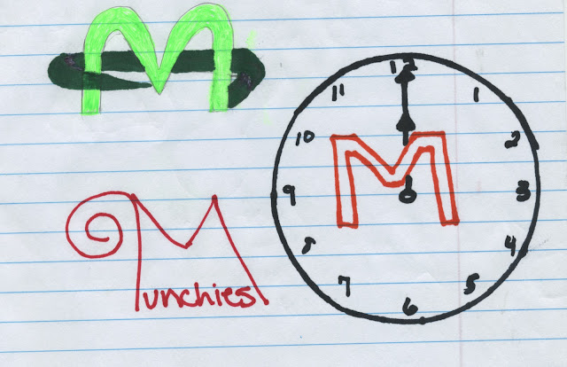
I want Munchies to be known as a great, reliable, place to get quality food, fast, late at night when people are desperate to put something in their stomachs.
9)If your company was an animal, what animal would it be and why?
If my company was an animal it would have to be an owl because they are notoriously nocturnal.
10) If your company/brand was a person, who would it be and why?
If my company was a person it would have to be just an average college student or maybe a group of students.
11) If your company/brand was an object, what would it be?
It would be a to go box.
12) If your customer was a cartoon character, who would it be?
If my customer was a cartoon character it would probably be Stewie from family guy because he likes to party and he is funny and would appeal to my actual customers.
Sunday, February 26, 2012
road to zion- assignment 4

My inspiration was the song Road to Zion by Damian Marley and Nas. I used one picture for the background, one for the walls, one for the road, and then the picture of the old man. i started with the background then cut out the walls from a picture of an alleyway and adjusted their size to fit. Then i cut the road out of another picture and added it in, I had to change the size and stretch it to fit. i added shadows for the walls on the road using the paint brush tool. The old man was the hardest thing to add, i had to use the quick selection tool and the magic eraser and regular eraser to cut him out of the picture i found, then brought him over and put him in a spot that looked realistic. I copied the layer he was on then filled it in with black and flipped it upside down then rotated it to add the shadow. I typed the words myself and staggered them so that it would look like it's going across the wall, then I used the horizontal distortion tool to make the writing get smaller further down the wall. The colors were an effect in the fonts. I also used the dodge tool to lighten the road and the top of the man's head and shoulders, and the blur tool to try to blend the walls in with the back ground.
Wednesday, February 15, 2012


I found this picture of some random desert online, and used a picture of myself taking off my ice skates in Sweden because I thought the combination would be funny. I used the lasso tool and the eraser to select just myself from the original picture then dragged it into the new one. i had to rotate myself to make it look like I was sitting then I used the dodge tool to lighten up the top of my jacket and my hood and drew the shadow with the paint brush tool on a new layer.
Monday, February 6, 2012

Monday, January 30, 2012

Friday, January 27, 2012
Logo Critiques

I personally like the Adidas logo. I think it is effective even though it's simple because it is recognizable. I don't think it's targeted towards any specific group of people, but I do think the fact that it is a plain black and white logo is helpful to the company because it can go with anything. Also the fact that it is easy to fit the logo into the products by putting three stripes on shoes, balls, clothes, etc makes it easy for people to tell when something is made by Adidas.
I think the Disney logo is great. It is obviously geared towards children, which makes it fun and cute, and easily recognizable. It is not as simple as the adidas logo, but it is simple enough that when you see it you immedaitely know what it's for. Also it is extremely versitile becasue it can be changed and complicated but maintain the same outline even when details are added.
I personally don't care for the brand Hollister, but I can say that the logo is effective because even though I don't buy or wear Hollister I can recognize it immediately just by its logo. It is very simple and sort of boring so I'd say it is definitely directed towards adults, but it is also gender neutral which is good because they make both men's and women's clothes. The fact that the bird part of the logo can be used individually on anything Hollister makes means that they are able to mark everything with a stamp that people recognize, making it an extremely useful logo.

I think the Harley-Davidson logo really works for their brand. It is harsh with very definite lines and straight to the point, which i think coincides very well with the image they want to establish for their motorcycles. It is not fun or playful so it wouldnt be directed at children, and it's also not colorful or very feminie so I'd say it had to be made with men in mind. Also, though black and white make the logo very simple, the bright orange makes it pop so it can bee seen from a distance and recognized no matter what the size.
The recycle logo is one that people see all over and know exactly what it means. I like this logo becasue while it doesnt use any words, it gets the point across. The arrows go around, like the process of recycling, and there are three of them while the motto is reduce, recycle, reuse. The fact that it is green is also not an accident because the whole movement for conservation is called going green. It doesnt target any demographic, but its simple enough that a child would recognize it, and the meaning behind it is significant enough that an adult would know what it stands for. I also like this one in particular because rather than trying to convince people to buy things, it is there to convince people to preserve the earth.
Monday, January 23, 2012
5 Need to Have Businesses
1. Munchies- Munchies is a delivery based restaurant that operates only at night between the hours of 12am and 6am, also known as drunk o'clock and serves comfort "sober up" foods. Munchies has a little bit of everything so that no matter what your sober up food is you can get it in the middle of the night. In order to discourage drunk driving munchies will not have a drive through window or a sitting area, but only deliver.
2. Magic Mirror- A line of full length mirrors designed specifically to make women look skinny when looking in them.
3. Pie Place- Pie Place is a restaurant that serves only pies. Here you can get almost any imaginable kind of dinner or desert pie in a pie shaped building.
4. Supernatural Fever-Fixer- This is a gag gift designed for all the vampire/werewolf addicted tweens across the U.S. to rid them of their supernatural character obsessions.
5. How to train your boyfriend- This is a series of books and pocket manuals with ideas for women to get their boyfriends to do what they want them to do without pissing them off or scaring them away.
Wednesday, January 18, 2012
About Me
Hi guys!
My name's Raychel Gadson and I'm a freshman PR and Ad major. I moved here in August from Kansas and so far I looooooooooooove Florida. I live off campus about 15 minutes from UT, and it's really cool to have my own space even though I miss some of the things that happen on campus. I like to play soccer, swim and generally be outside. I work in Ybor at a club as a promoter which is cool because it's relevant to my major and a lot of fun, but it also means I'm pretty much nocturnal. I hope this class will help me become a little less computer illiterate, and give me a chance to do more with art because I've been missing it.
My name's Raychel Gadson and I'm a freshman PR and Ad major. I moved here in August from Kansas and so far I looooooooooooove Florida. I live off campus about 15 minutes from UT, and it's really cool to have my own space even though I miss some of the things that happen on campus. I like to play soccer, swim and generally be outside. I work in Ybor at a club as a promoter which is cool because it's relevant to my major and a lot of fun, but it also means I'm pretty much nocturnal. I hope this class will help me become a little less computer illiterate, and give me a chance to do more with art because I've been missing it.
Subscribe to:
Posts (Atom)